Map Illustration with artist, Rafal Liszewski
Initial consultation meeting:
When I commissioned Rafal Liszewski to illustrate the map for When the Blue Moon Wakes, I came to our initial meeting fully prepared with a concept board I created on Milanote. It was my first experience using the program and I found it extremely intuitive to input and organise text, images, photos and excerpts from the book all in one place.
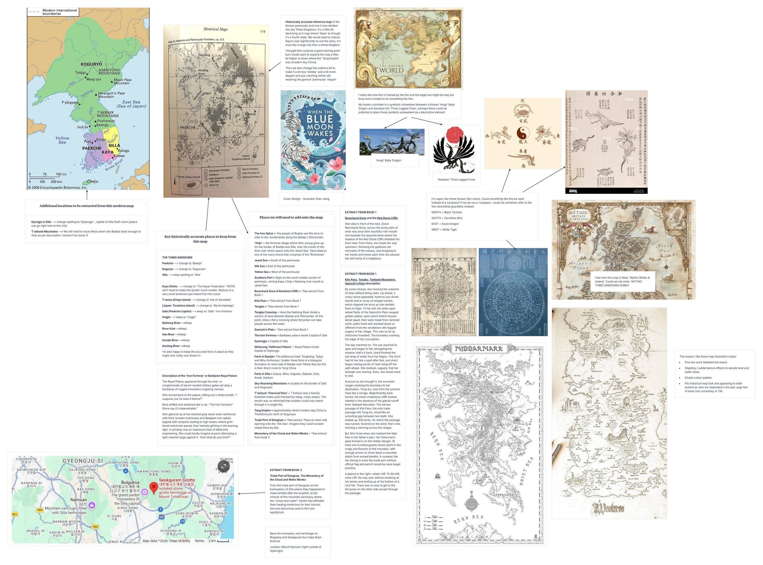
I included the following details:
A true historical reference map of the Three Kingdoms designating the Three Kingdoms’ borders, key fortresses, capital cities and topographical features such as major rivers and mountains.
An image of the front cover illustration by Shan Jiang so we could work towards a complimentary style and tone.
Inspiration photos of fantasy maps I thought suited the ‘vast’, epic’, ‘ancient’, and ‘rugged’ landscapes described in the book.
Framing choices and culturally significant decorative symbols.
Key passages in the book which describe the landscape.
A list of landmarks that were historically accurate and needed to be kept, alongside a list of fictitious landmarks that would need to be added.
During this meeting, Rafal asked me many questions. These were the ones that stood out:
After looking at examples of different map conventions, what were my preferences for illustrative techniques for visually highlighting important landmarks?
Did I want it to feel like a real historical artifact? Or did I want there to be visual allusion to the myth and magic? Ie: Did I want the map to represent the understandings and beliefs of the people in the fictional world, or to speak to the reader’s knowledge of the genre and magic system? *This question blew my mind!!!
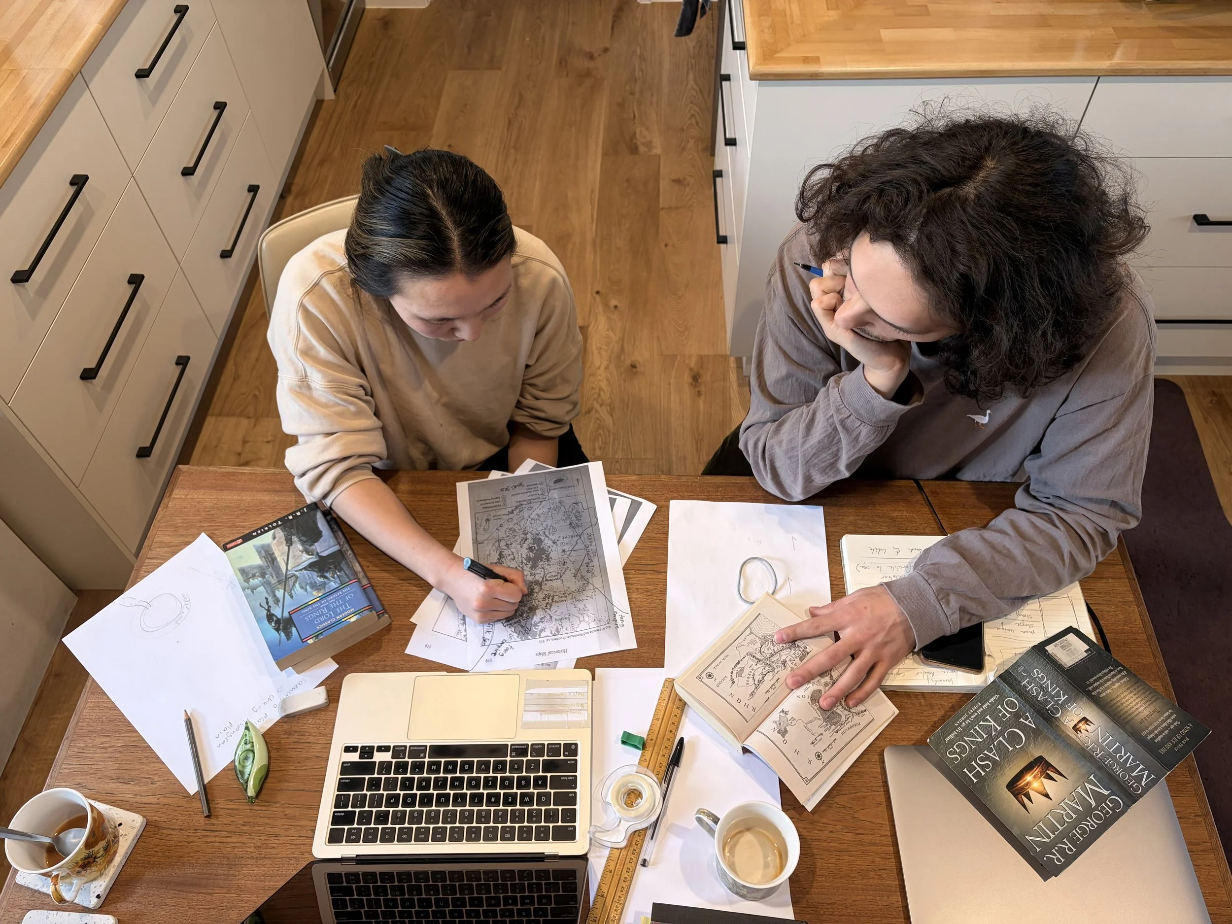
Here we are discussing the important plot elements of Shin-young’s hero’s journey that need to be reflected in the map. Rafal also made sure at this point I was fully aware of what could realistically be achieved once the mechanical and technical aspects of digital illustration and printing process came into play.
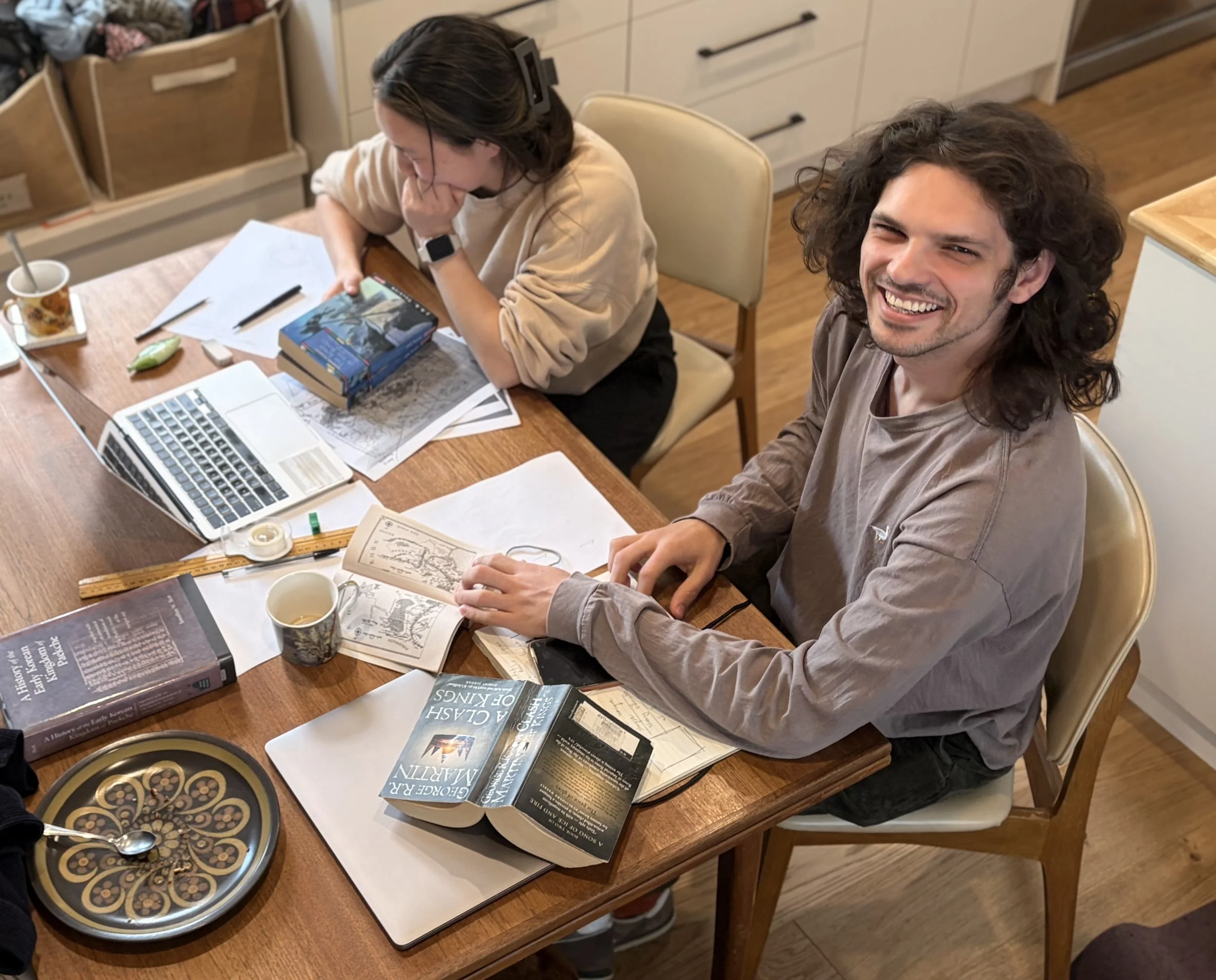
By the end of the meeting, we had finalised a footprint of the peninsula and its key topographical elements. We had made decisions about the illustrative style and decided on rough timelines and communication preferences as we moved through to part two of the process —>concept sketches.
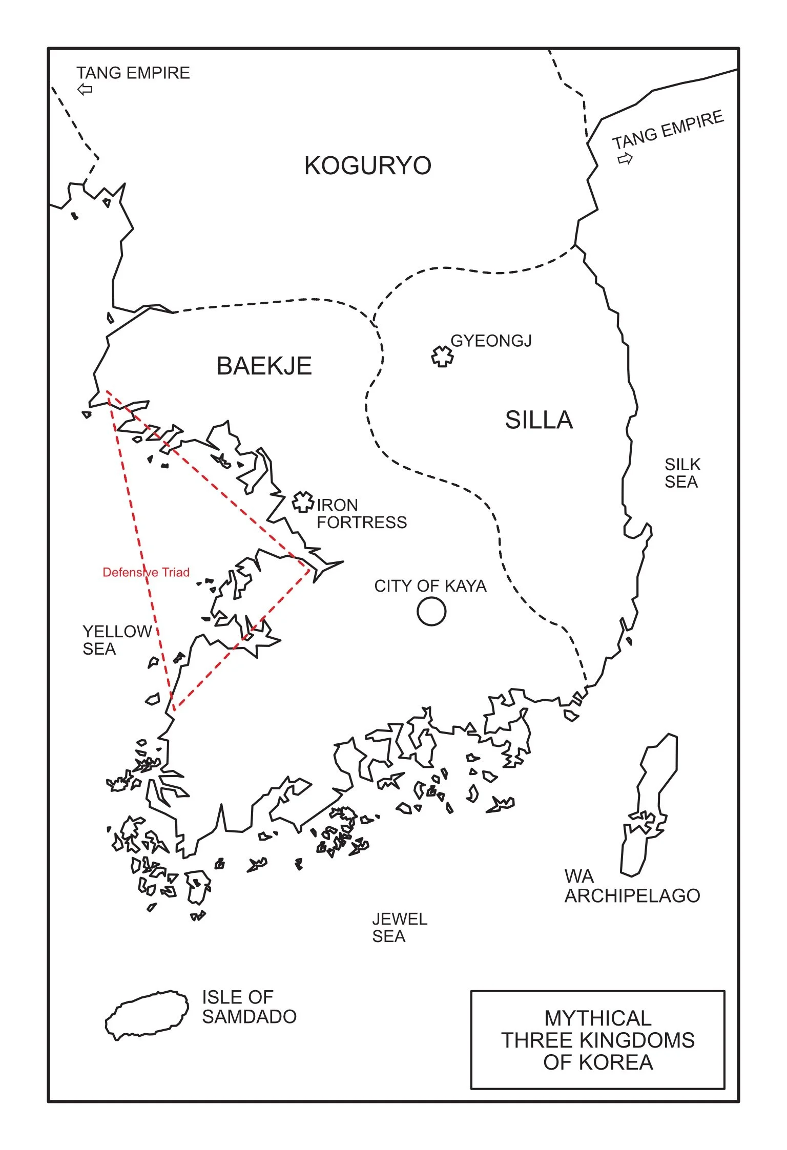
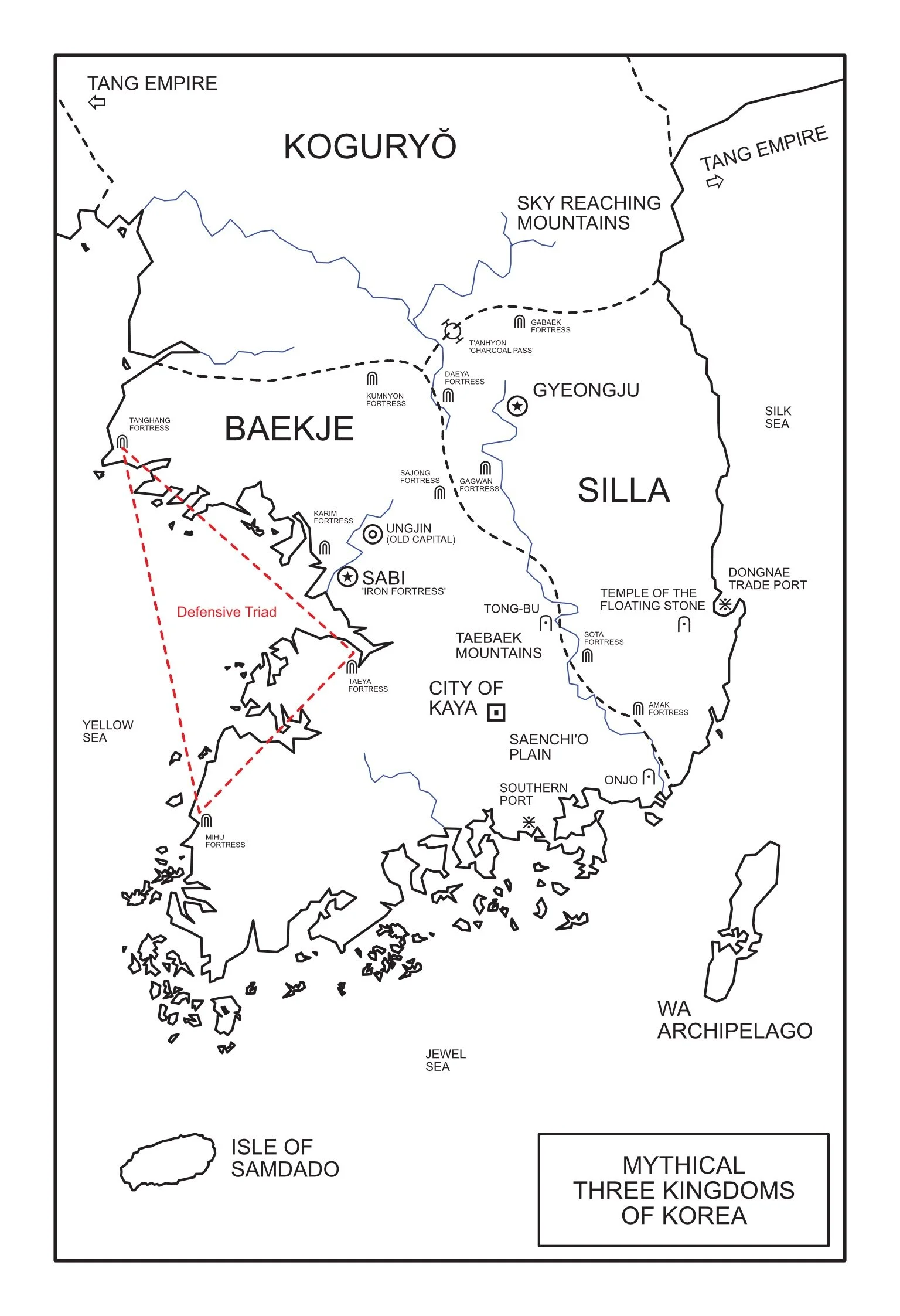
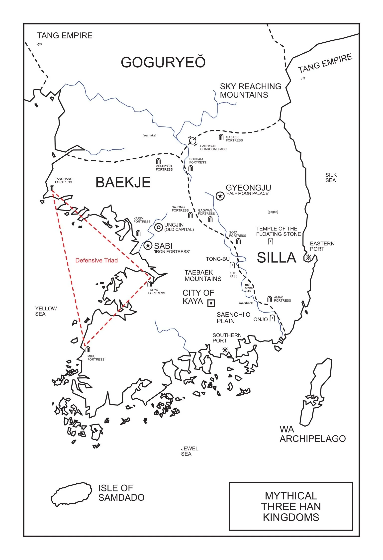
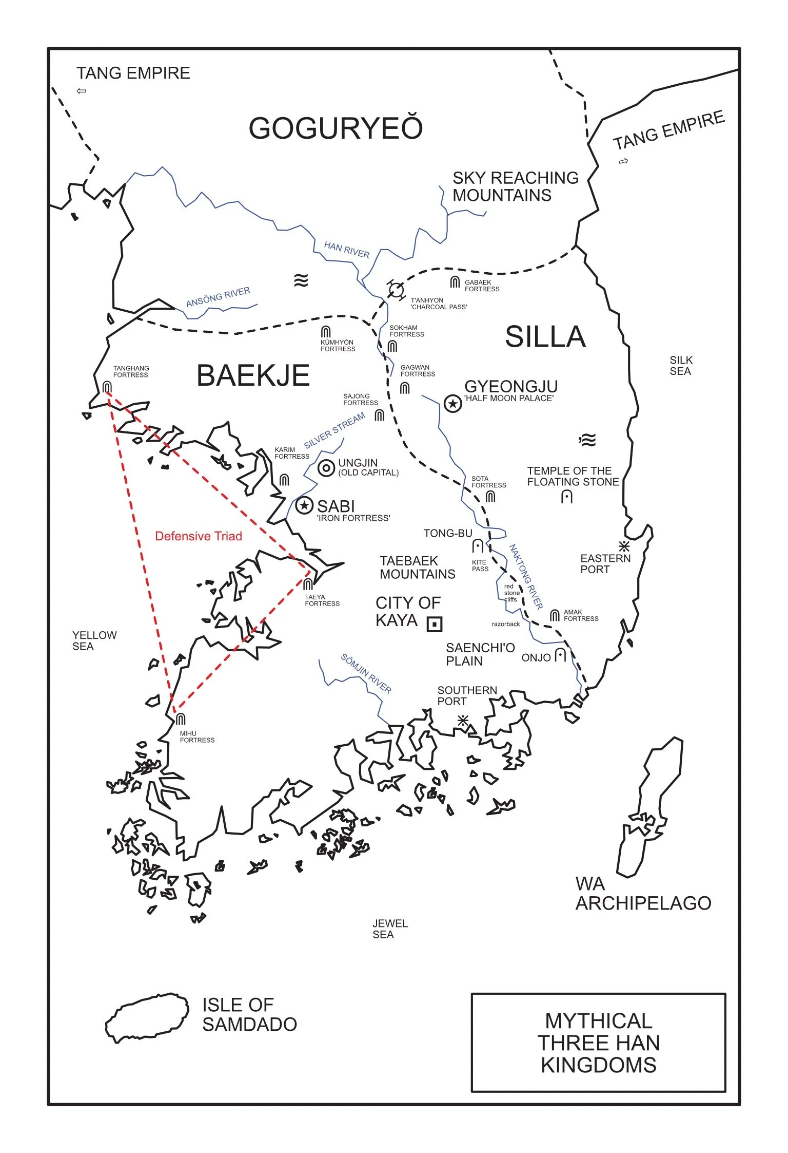
Before I knew it, Rafal had already come back to me with the above concept sketches.
These were a basic blueprint to make sure each element was placed correctly before more detail was added. This was an incredibly technical process - cross referencing each item against the narrative was tougher than I thought. It was here that we made design decisions on how I wanted to balance scale, size and distances with illustrative representations for various landmarks. This was an incredibly important process before moving forward to the illustration. At the end, I was so excited to see my Three Kingdoms landscape begin to take shape!
And then . . .
A couple of days later, Rafal gave me a sneak peak of a font he owns the license copyright for and asked if I would be interested in using it on my map!
The typeface is called Robert Green’s, The Doves Type: here
I fell over backwards. It was absolutely beautiful.
…
…
And then he sent me this . . .
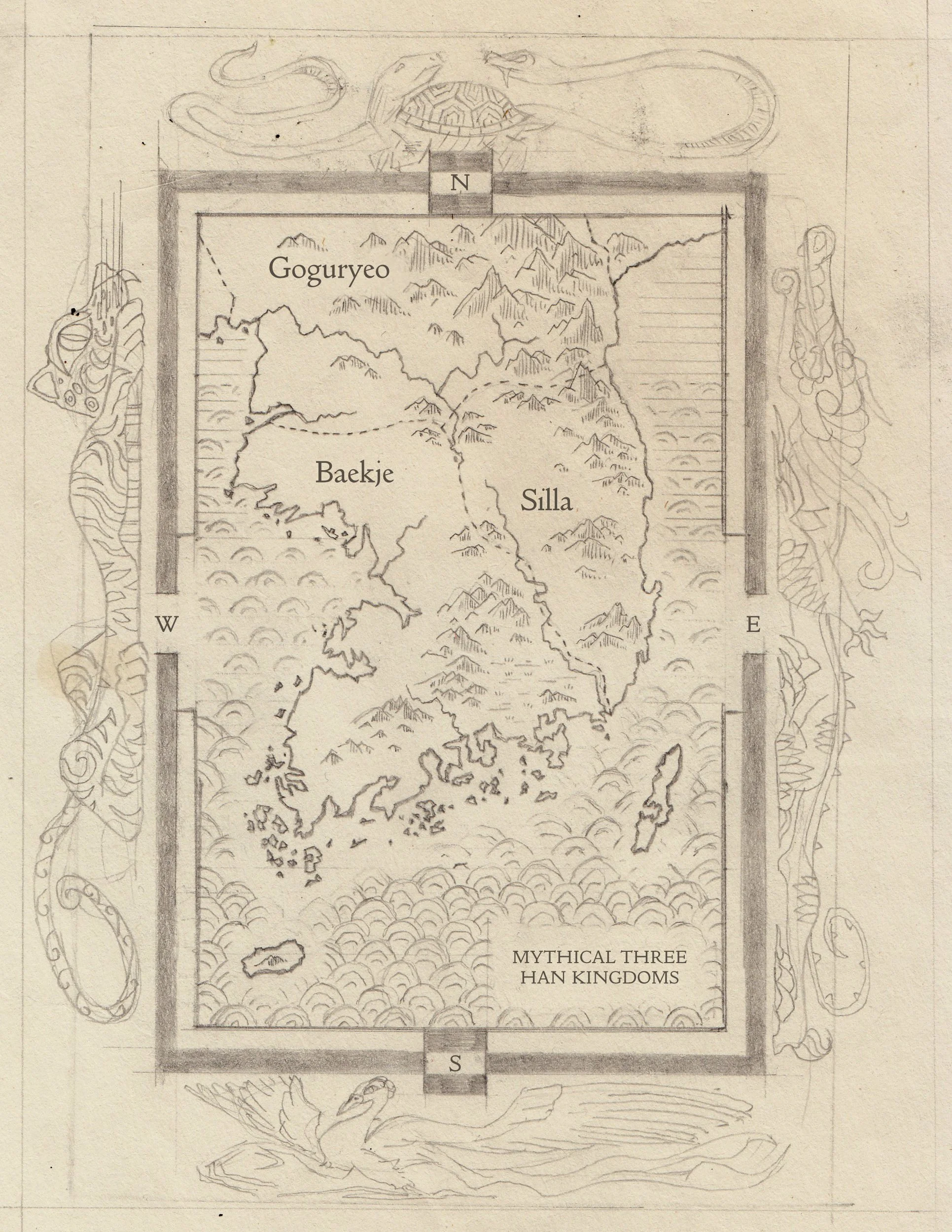
And I fell off my chair.
Here was the email he sent with it:
Hello!
Attached is the pencil draft of the visuals that surround the map and the style of the map. I have added basic font placement just to show how things can sit. If you are happy with this visual direction, then I will refine adding all points of interest and type. The figures outside the border will be left as outlines to not distract too much from the actual content of the map.
---
The solid visual border was inspired by an Artist (2016) who recreated traditional clothing from the 5th century. https://artsandculture.google.com/asset/traditional-clothing-of-the-goguryeo-kingdom-kim-jeong-ah/XAFptItuTWa09w?hl=en
The sea is inspired by Korean embroidery, I intensified the waves as we head south to represent the spiritual/mythical journey to Samdado. Showing boundaries of divinity. https://en.wikipedia.org/wiki/Korean_embroidery#/media/File:Korean_embroidery_patterns.jpg
The cardinal directions are the 5 guardians that you showed me. They are quite rough at the moment as I feel the visual language of their proportions can be fixed and I feel all their eyes need to reflect more a realistic / natural instead of an illustrated look. (The white tiger definitely needs more refinement.)
The downward strikes of the cross hatching omn the mountains are inspired by Kim Hongdo 18th century fishing illustration https://smarthistory.org/wp-content/uploads/2022/08/Fishing-scaled.jpg
---
Let me know your thoughts! If it is visually too much, we have the option of removing the illustrations of the cardinal directions to just the border. I am available all day tomorrow and friday for phone calls and discussion.
Watch this space for PART III of the process still to come
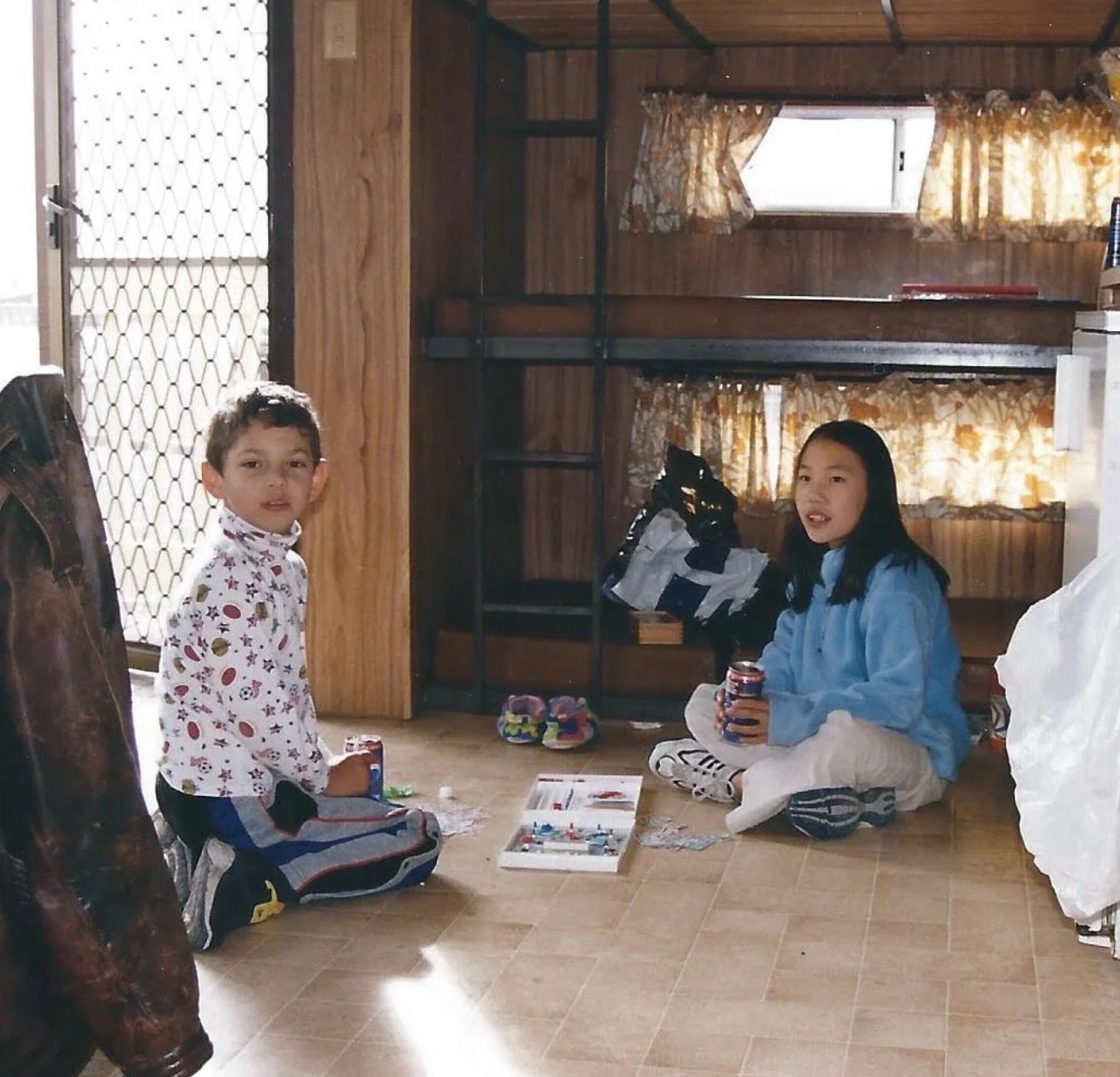
Rafal and I have been thick as thieves since we were children. Creating treasure maps was a favourite activity to accompany our wildly imaginative pirate games growing up. While I don’t have any pictures of our early masterpieces, here is a photo of us versing each other in Battleships.
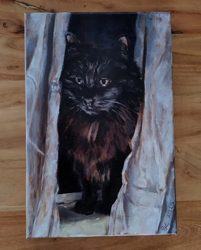
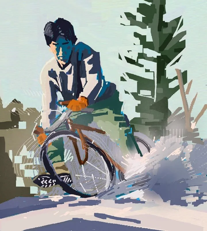
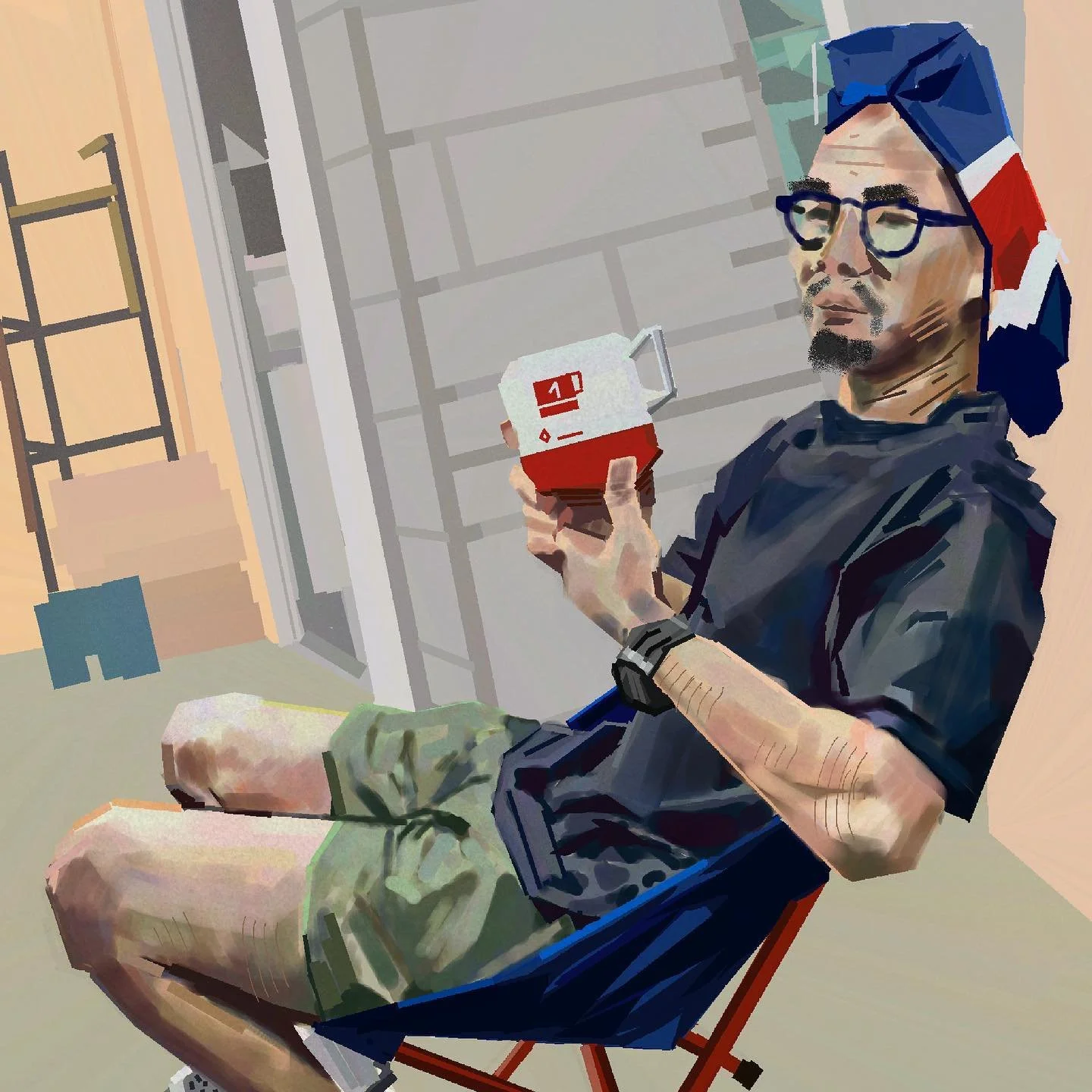
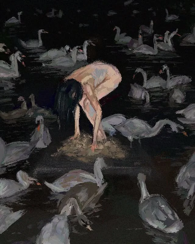
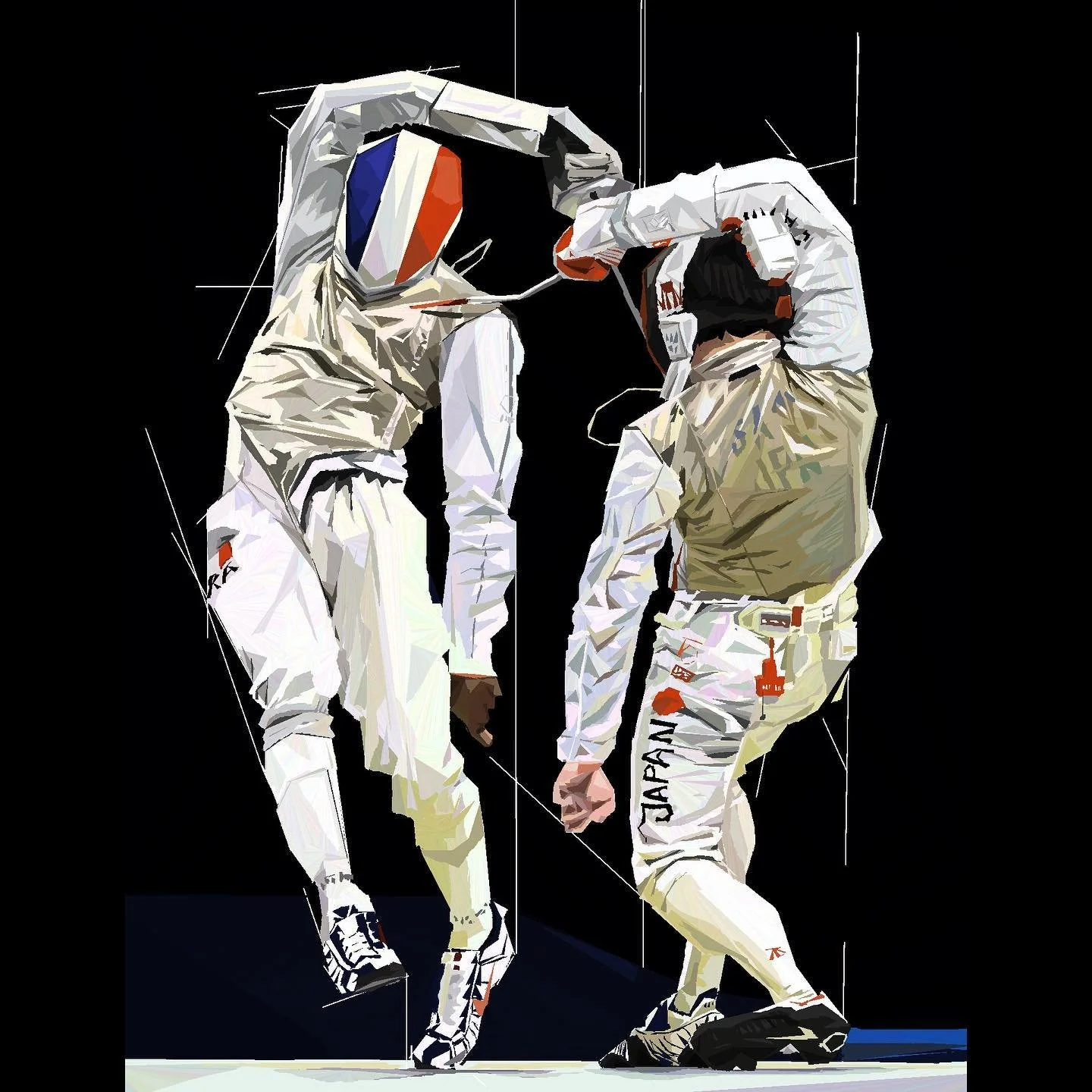
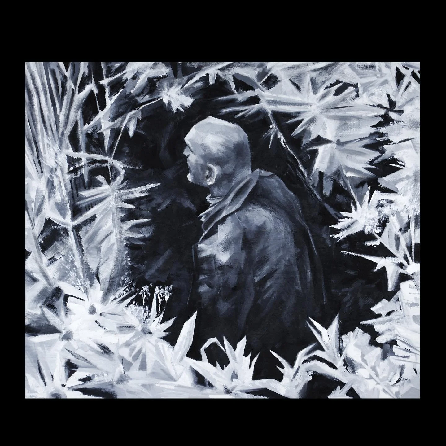
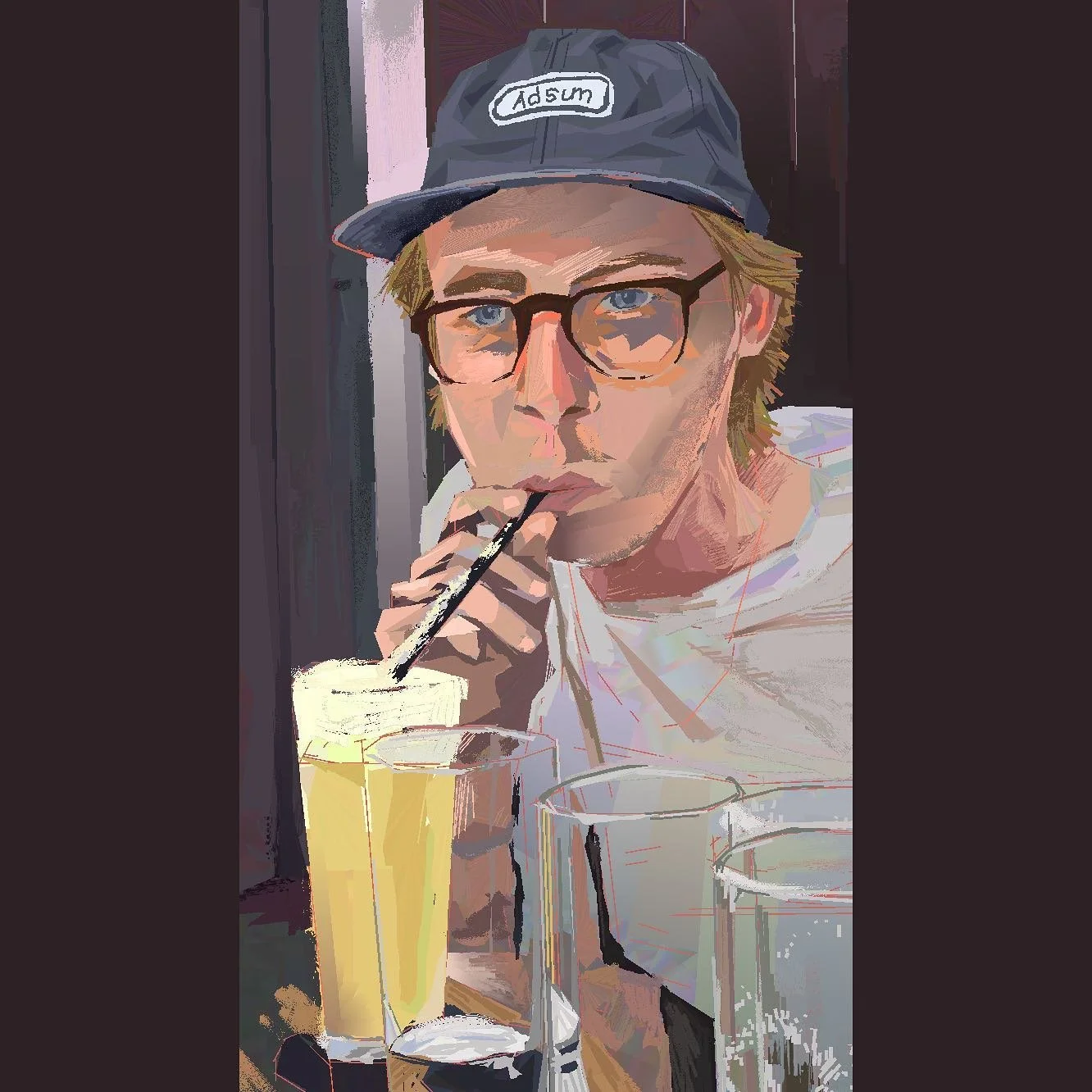
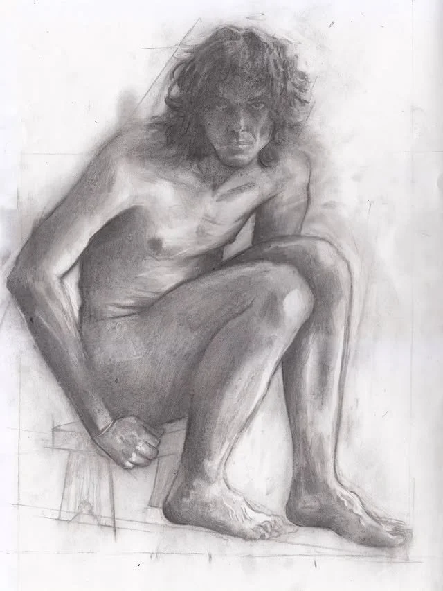
Rafal Liszewski is a freelance Melbourne-based artist whose work has featured at Brunswick Street Gallery and The PaintBox. The aim of his work is to:
“Transform ambiguity to create a narrative and atmosphere that engages audiences.”
Through his co-established graphic design company ‘Small Room’ at The Mill, he collaborated with brands and companies in the areas of graphic design, illustration, and screen printing. While his primary focus is oil-painting, he is sometimes open to illustration commissions of all kinds. :D
You can find him on:
Instagram: @raf_lisz


