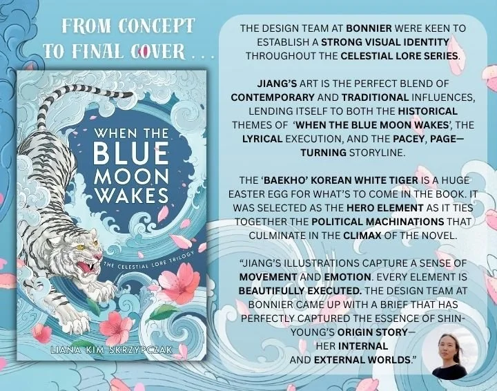
The design team at Bonnier were keen to establish a strong visual identity throughout the Celestial Lore series. One of the key things we discussed was creating an identity that would work for each book in the trilogy individually, but also as a whole.
Concept sketch below:
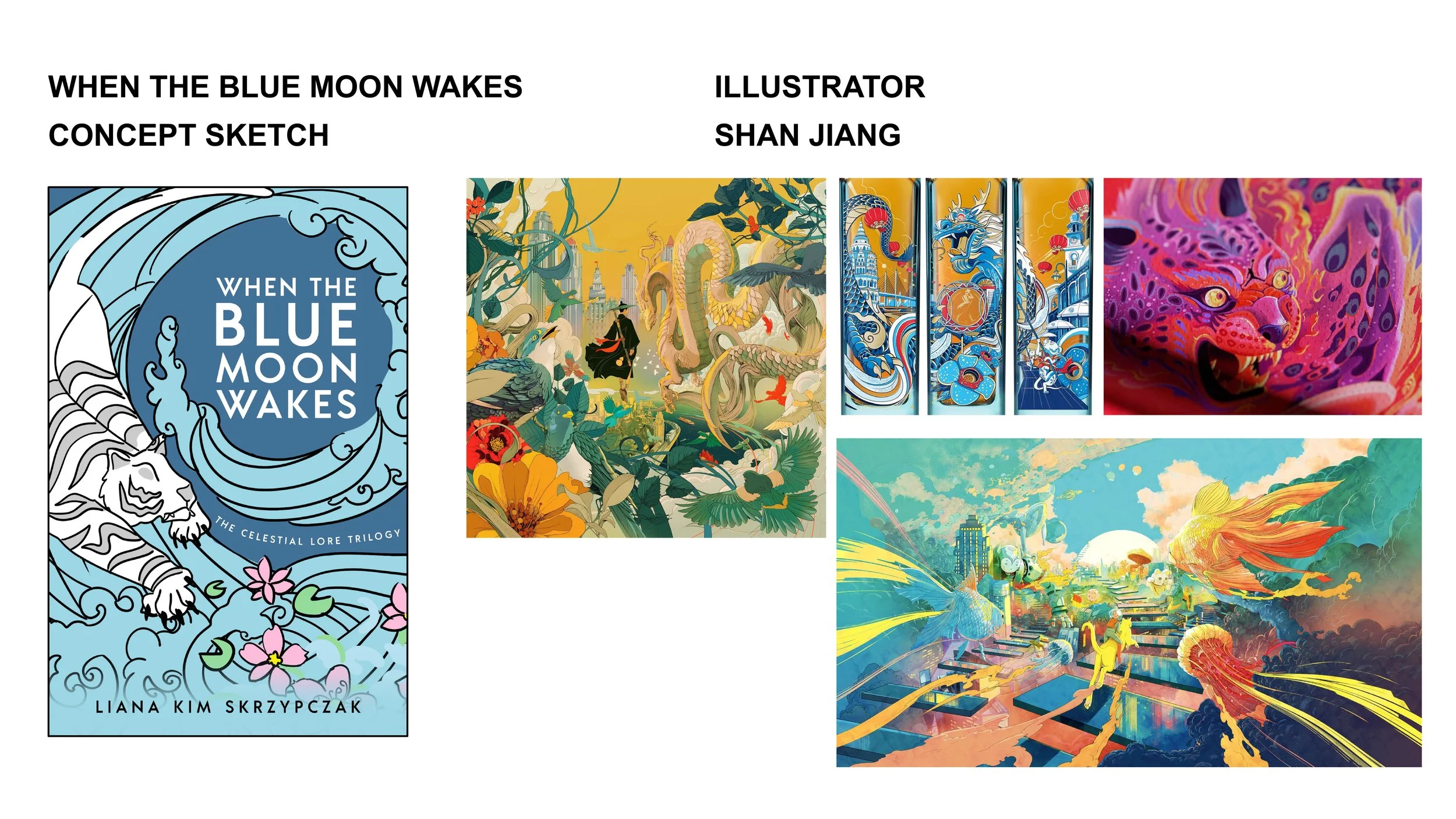
A sense of motion was very important to the team. Upwards movement for Shin’s ‘awakening’ of her powers. The circular shape of a wave and how it links to the prophecy about the moon rising and the sun falling AKA ‘water’ versus ‘fire’ and the rise and fall of Eum and Yang as opposite forces fighting for balance in the same way that feminine and masculine attributes war in the book. The lotus flowers represent Shin’s coming of age as a punter on the Whispering Lake.
The space for the title alluded to a moon for its shape as we wanted to steer away from being too literal. A lot of research went into comparative titles in the market, many of which are highly decorative and feature multiple elements, but as Moon spans beyond the core genre audience, we were keen to pare this back and give focus to one element.
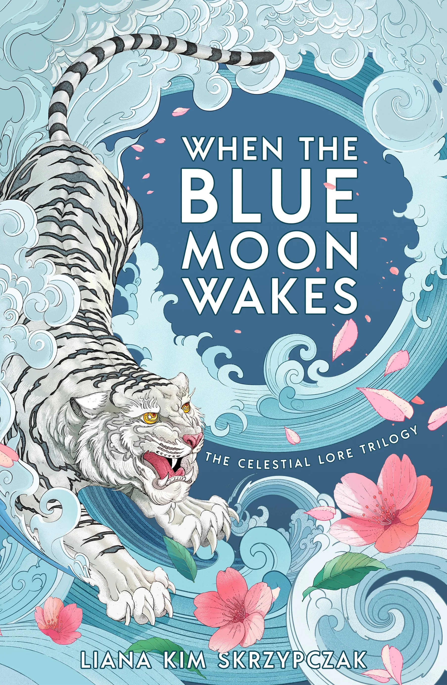
Baekho, the Korean white tiger, was a huge easter egg for what’s to come in the book. It was selected as the hero element as it ties together the political machinations that culminate in the climax of the novel.
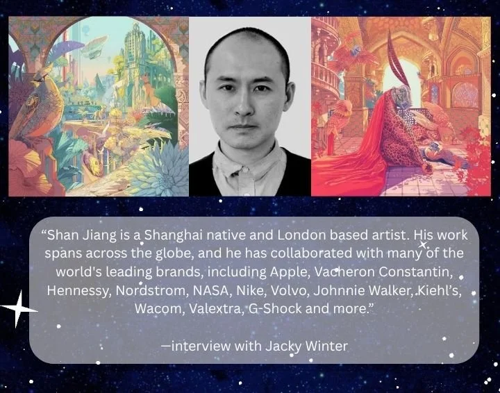
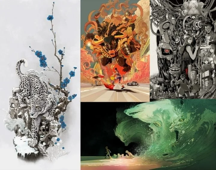
Jiang’s art was chosen as it is the perfect blend of contemporary and traditional influences, lending itself to both the historical themes, lyrical execution and pacey, page-turning storyline.
Jiang’s illustrative style captures a sense of movement and emotion. Every element is beautifully executed. The design team at Bonnier came up with a brief that has perfectly captured the essence of Shin-young’s origin story — her internal and external worlds.
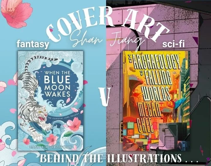
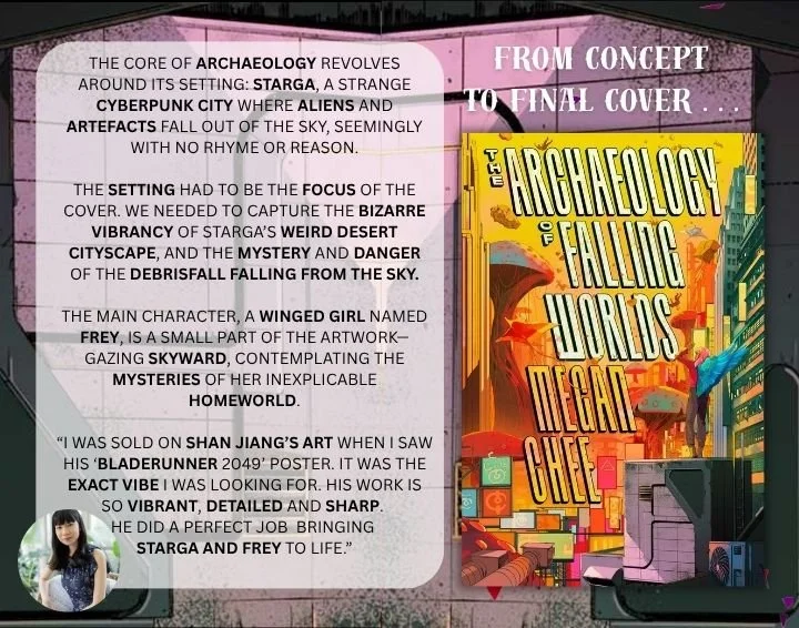
In the lead up to When the Blue Moon Wakes cover reveal, I collaborated with author, Megan Chee, whose debut science-fiction novel was also illustrated by Shan Jiang and is coming out with Bindery Books in 2027.
We created a side-by side visual of our work to showcase Shan’s art and to also give insight into our publisher’s design briefs and concept discussions.
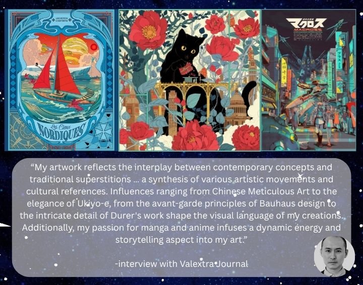
In tile four and five of this series, you can read more about Shan Jiang’s illustrative inspirations and artistic influences including Chinese Meticulous art, Ukiyo-e, avant-garde principles of Bauhous design, anime and manga.
Here is a snippet from my raw reaction to seeing the cover for the first time (taken from emails with my editor). I think it says it all! :D
—————————————————————————————————————————————————
Kellyyyyyyyy!!!
It's taken me all morning to be able to formulate the words to express how much I love this cover. And to know how thoughtfully it was designed and executed by the team at Bonnier alongside the incredible Illustrator Shan Jiang! What a beautiful collaboration. Thank you to everyone involved. My author heart is bursting. I have done nothing but stare at it ALL MORNING in a dream-daze. Every time I look at it, I notice something different and even more evocative about it. It's the gift that keeps on giving!
The expression on the tiger's face. And his eyes and body are so emotive! Hopeful, angry, sad, scared, broken, powerful and so much more. I love the colour of his eyes. They draw attention to his gaze looking up at the words. I love how he is in black and white, and stands out because of the detail and stippling. Everything is bursting with movement, life, mystery, questions and story. JUST SOOOOOO GOOD.
I love the flavour of the artist's inspiration: anime/manga, surrealism, ancient Chinese Meticulous art, Ukiyo-e, Durer art and how the figures float upwards like this. I can FEEL all these elements coming together to blend is such a perfect way. To give a nod to both the historical themes, the lyrical language, but also the pacey commercial storyline too.
I love the delicate interplay between the title and the petals with a little flow and overlap between them. I love the choice of colour scheme. Pink and blue. But still not too masculine or feminine. I think the tiger balances out the flowers perfectly! Even the touches of green are perfectly placed. Ohhhhhhhh I can't get enough of it! haha
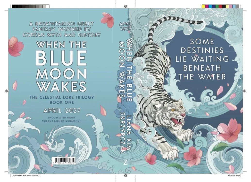
Above is an image of the final proofs which were sent out to advance readers in the form of ARCs. This was equally exciting to see Moon packaged for early readers! The team did such an amazing job!
